
When you rely on contact lenses to see the world clearly, ordering them shouldn’t be a blur of clicks, confusion, or last-minute stress. That’s exactly what LensOnline—a major player in the Belgian, Dutch, and Italian markets—wanted to fix. So they turned to us.
Their ask? “Help us make ordering lenses so easy, our customers barely have to think about it.”
We said yes. With both eyes open.

From “Ugh, I forgot to order” to “Done already?”
People don’t wake up excited to order contact lenses. It’s a background task, a life admin checkbox—until something goes wrong. Running out mid-week. Mixing up brands. Wading through an outdated system when all you want is your usual reorder, fast.
So we started by digging into the real-life moments LensOnline customers face. The everyday lens wearers who need reliability. The occasional users who dip in and out. The planners. The procrastinators. The “I’ll just squint for today” crew.
We mapped personas, charted customer journeys, and gathered stories. From user interviews to social media rants, we paid attention. Because great UX doesn’t start with wireframes. It starts with empathy.
The aha moments
Armed with insights, we uncovered features that could genuinely make life easier:
-
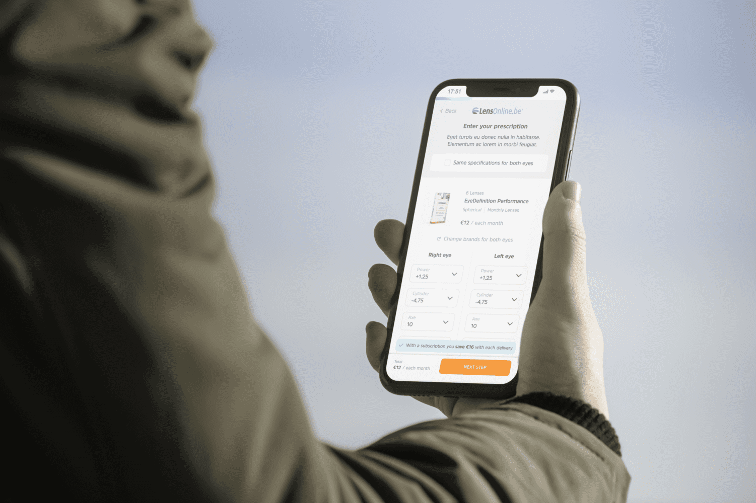
Seamless reorders that remember your exact combo (yes, even when your right eye wants something different).
-
Subscription options for the truly done-thinking-about-it crowd.
-
Smart prompts before you run out—because remembering should be the app’s job, not yours.
Wireframes, feedback loops & real-world weirdness
We turned those ideas into wireframes. Then prototypes. Then conversations—with LensOnline, with testers, with the tiny details real life throws at you. Like ordering a new brand for just one eye. Or realizing mid-order you can’t remember your usual specs.
Each round of feedback sparked new ideas. Not just “does this work?” but “does this feel right?” That collaboration shaped the design, guided testing, and kept us focused on the end goal: make this feel effortless.

What’s launching (and what’s next)
Development is now in full swing. And we’re not stopping there—we’ve also been asked to redesign the entire webshop experience. Because once you start removing friction, it’s hard to stop.
Stay tuned. The smoother, smarter LensOnline is just getting started.
Looking to level up the UX and UI of your webshop—just like Lens Group?
Call Us and we’ll help you turn challenges into smooth solutions.