I don’t do curls. I don’t do drama. And I definitely don’t do situationships.
I’m all about clarity. Straightforward vibes. You know where I stand: clean, modern, direct. No mixed signals, no decorative distractions. Just design that speaks for itself and leaves before it gets clingy.
Serif? She’s the nostalgic type. Into legacies, footnotes, and emotional backstories. Me? I’m the text your ex thinks about when their new template gets too complicated.
You’ll find me where things are sleek and intentions are clear—think luxe skincare, cutting-edge tech, boutique architecture firms, that one founder who only wears black turtlenecks and white sneakers. I’m on your favorite museum wall, your go-to app interface, and every quiet luxury label worth its minimalist price tag.
I’m not just one-note though. I can be geometric and bold like Futura when you need impact, or warm and approachable like Gill Sans when you’re building trust. But I’m always honest about what I am—no decorative lies, no traditional pretense.
Use me when your brand wants to look sharp without trying. When you’re done playing games and ready for design that just gets to the point. When you need to work flawlessly across every screen, every size, every platform.
For real, I’m not here to impress your grandmother with fancy flourishes. I’m here to make you look good everywhere—from billboard to smartphone, from boardroom presentation to Instagram story.
So, when should you use sans serif?
When you want design that’s confident and versatile. When your message matters more than showing off. When you need something that works as hard as you do, looks good doing it, and never asks for credit.
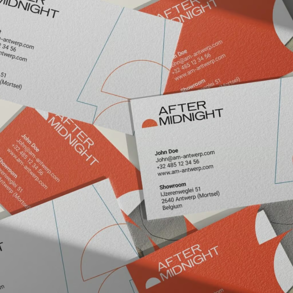
Clean lines. Strong presence. Perfect readability.
Minimal effort. Maximum impact.


Ready for a brand that speaks as clearly as Sans Serif?
Let’s design something that gets straight to the point.

