
What happens when a globally renowned stud farm admits: “Our visuals need to match our reputation.”
Even the most iconic brands stall sometimes. Not because they’ve lost their magic, but because the packaging stops keeping up. That was Zangersheide’s situation: fabled in the world of sport horses, organizing the Jumping World Cup, selling elite horses via auctions… but with branding that felt stuck in the 70’s. They deserved better — and they knew it.
We got handed the reins. What started as a logo tweak turned into a full-on visual, strategic, and digital reset. Because surface-level polish is nothing unless every touchpoint walks the walk.

Prestige Without Consistency
Don’t mistake us: Zangersheide is elite. And yet:
- Multiple websites for different sub‑parts
- A logo that hadn’t seen proper love in decades
- Catalogs, ads and social posts that each spoke their own visual language
Loads of prestige. But no unified voice. That was the gap we stepped into.

Small Moves, Big Leaps
We began with the logo. Goal: keep the heritage. Upgrade the feel.
- Refined silhouette
- Elegant, legible type
- Subdued use of the horse motif
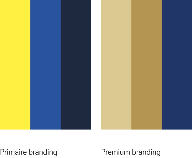
That unlocked room to build around. We established a colour system:
- Blue‑&‑yellow for everyday communication
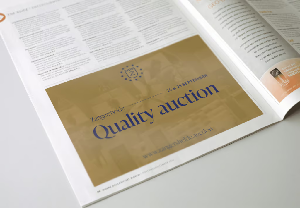
- Gold for marquee moments (think: the World Cup, high‑end auctions)
Clear visual cues. Zero blandness.
A Fresh Look Without Losing the Soul
They didn’t want a radical reinvention — just a rebirth. One that honors their legacy while pushing forward.
-
We chose IvyPresto Display, a script font that’s modern and elevated
-
Built graphic overlays & patterns using their shield icon, subtle but unmistakable
-
Amplified the gold accents so Zangersheide feels unmistakable, even at a glance
We gave them identity that feels classic AND current — the balance every heritage brand chases.


Site Restructure: From Fragmented to Firm Foundation
Biggest obstacle? Their digital presence was splintered. Multiple sites. Mixed messages.
We partnered up (shout‑out Tailr & PHPro) and ran workshops to map out what Zangersheide actually needed.
Out of that came a streamlined site structure. One experience, consistent architecture — mobile first, prestige pages aligned, navigation crystal clear.


Bringing It All Together
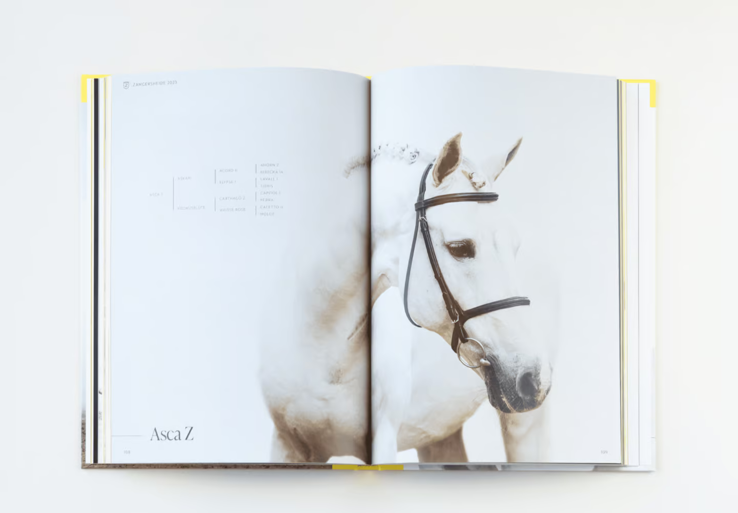
Their catalogue got the full polish. Responsive logo? ✅
Social media templates so they can share with confidence? ✅
‘Z‑Magazine’ infoblad, branded trucks, everything getting upgraded.
The result: Zangersheide is no longer just known. They’re seen. Their look matches their legacy. They sit in the saddle with purpose — and with presence.

Boost je Social Media en brand awareness en co-creëer impact met Us.
Contact Us en we helpen je uit de nood!

